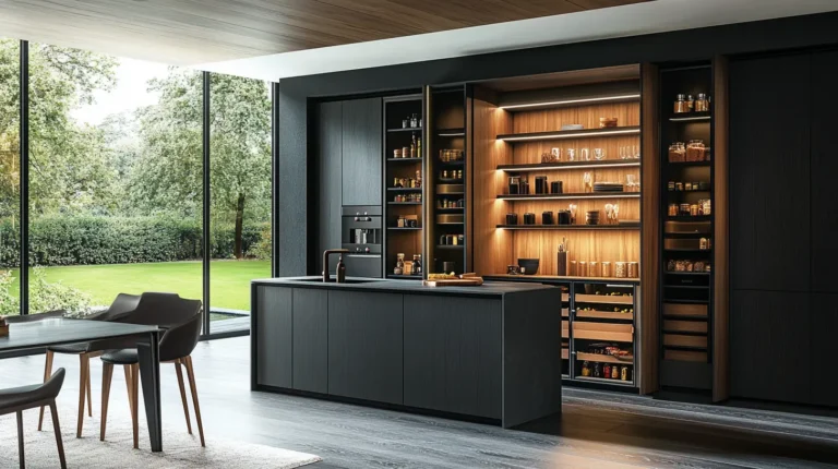
Choosing the right kitchen cabinet and countertop color combinations is about more than finding two colors that look good together. The cabinet finish, countertop material, undertones, and surface patterns all affect how your kitchen looks as a whole.
Table of Contents
ToggleWhether you’re choosing new kitchen cabinets or looking for countertop colors to complement your existing cabinetry, the right combination can make the space feel more balanced and cohesive. This guide covers five practical ways to match cabinets and countertops, compares 10 color and material combinations, and explains what to check before placing your order.
How to Match Kitchen Cabinet and Countertop?
Choosing kitchen cabinet and countertop color combinations starts with more than picking two colors you like. The undertones, contrast, patterns, and materials all affect how your kitchen comes together. These five steps will help you narrow down your options and find a combination that suits your space.
-
1
Start with What You've Already Chosen
If you're remodeling, start with the cabinets you're keeping. Their color and finish will help narrow down your countertop options. For a new kitchen, decide which material or finish matters most to you first. A distinctive natural stone slab, for example, can become the starting point for the rest of your kitchen's color palette.
-
2
Look Beyond the Main Color
A white countertop can look surprisingly blue next to cream cabinets. Pay attention to the undertones in both finishes, not just their main colors. Warm white or beige quartz may sit more naturally beside cream cabinetry, while cooler stone can complement gray cabinets. Mixing warm and cool tones also works when the contrast feels intentional.
-
3
Choose the Right Level of Contrast
Light countertops can brighten dark cabinets, while dark surfaces create a stronger contrast against pale cabinetry. Similar shades give the kitchen a softer, more unified look. You can also use a contrasting kitchen island countertop to introduce a different color without changing the entire cabinet and countertop palette.
-
4
Balance Colors with Countertop Patterns
If your cabinets have prominent wood grain or a strong color, a countertop with subtle veining can keep the overall look balanced. A bold, marble-look surface makes more of a statement against simple cabinet fronts. Think about how much visual detail you want in the room, rather than choosing each finish on its own.
-
5
Consider the Material, Not Just the Color
Quartz, natural stone, porcelain, and butcher block can all create different looks, even in similar colors. Polished surfaces reflect more light, while matte finishes tend to look more subdued. Material choice also affects everyday care, so consider the surface texture, durability, and maintenance requirements alongside the color.
Kitchen Cabinet and Countertop Color Combinations Chart
Looking for the right combination for your kitchen? This chart compares 10 cabinet and countertop pairings by color, material, and overall look. Use it to narrow down your options, then explore the combinations below for more specific selection tips.
| Cabinet Finish | Countertop Color & Material | Design Effect | Best For |
|---|---|---|---|
| Mushroom Taupe | Beige Travertine-Look Porcelain | Warm neutrals with subtle stone movement | Warm neutrals with more depth than plain beige |
| Olive Green | Cream Terrazzo | Earthy color with a soft, speckled texture | Earthy colors and a little speckled texture |
| Terracotta | Ivory Solid Surface | Warm, cohesive tones with a smooth finish | Clay-inspired warmth with a clean, understated surface |
| Butter Yellow | Dark Gray Soapstone | Soft yellow balanced by bold, dark contrast | Sunny cabinets grounded by a dark countertop |
| Deep Teal | Sand-Toned Sintered Stone | Rich color balanced by warm, light stone | Bold cabinet colors without stark black-and-white contrast |
| Mist Blue | Almond Recycled-Glass Composite | Cool blue paired with warm, subtle texture | A light, relaxed palette with understated texture |
| Natural Cherry Wood | Blue-Gray Quartz | Reddish-brown wood grain against cool stone | Natural wood with a cooler, more contemporary edge |
| Dusty Rose | Warm Ivory Quartz | Soft pink tones with a light, warm surface | Muted pink that feels soft rather than overly sweet |
| Charcoal | Butcher-Block Wood | Dark cabinetry softened by natural wood grain | Dark cabinets balanced by the warmth of natural wood |
| Warm White | Blue-and-Gold Quartzite | Neutral cabinetry highlights expressive stone veining | A statement island that sets the kitchen's color palette |
Swipe horizontally to view the complete table.
10 Kitchen Cabinet and Countertop Combinations
These kitchen cabinet and countertop color combinations offer different ways to balance color, texture, and material. From warm neutral pairings to bold cabinet finishes and statement stone, each example highlights a different approach to choosing countertops that complement your cabinets.
1. Mushroom Taupe Cabinets with Travertine-Look Porcelain Countertops

If you want a warm, neutral kitchen without going all-white, mushroom taupe cabinets are a good place to start. They work well in organic modern and transitional kitchens, while beige travertine-look porcelain adds subtle texture without making the countertop feel too busy. Pay attention to the undertones when choosing your materials: gray-leaning taupe pairs naturally with greige porcelain, while browner taupe works better with creamier beige shades. This combination is also a good fit for open-plan kitchens, where softer colors help the kitchen blend naturally with the surrounding living space.
2. Olive Green Cabinets with Cream Terrazzo Countertops

Olive green cabinets paired with cream terrazzo countertops bring warmth and natural character to a kitchen without making it feel too dark. The cream background softens the deeper green, while beige, brown, or muted green chips help tie the two colors together. If you prefer a subtle look, go for terrazzo with smaller, evenly spread fragments. Larger pieces add more personality and make the countertop stand out. This combination works especially well in contemporary and Mediterranean-inspired kitchens, particularly if you like earthy colors but don’t want the space to feel too busy.
3. Terracotta Cabinets with Ivory Solid Surface Countertops

If you like warm, earthy colors, terracotta cabinets are a great way to add character to your kitchen without relying on bold patterns or decorative details. An ivory solid surface countertop keeps the look balanced, with a smooth, understated finish that lets the cabinet color stand out. You can lean into the warmth with a muted terracotta and creamy ivory, especially if you prefer a softer look to the contrast of bright white. This pairing works well in Mediterranean-inspired kitchens and in more contemporary spaces that need a little warmth.
4. Butter Yellow Cabinets with Gray Soapstone Countertops

Butter yellow cabinets bring a cheerful warmth to the kitchen, while dark gray soapstone gives the color contrast and depth. The stone’s matte finish and subtle veining add texture without taking attention away from the cabinets. Warm wood floors and brass hardware help soften the contrast, making this pairing especially appealing in farmhouse, cottage, or vintage-inspired kitchens. Keep in mind that soapstone can darken with mineral oil and develop a patina over time, so view a finished sample before choosing your preferred look.
5. Deep Teal Cabinets with Sand-Toned Sintered Stone Countertops

Deep teal cabinets already bring plenty of color, so sand-toned sintered stone is a good alternative to a bright white countertop. Its warm beige surface softens the blue-green finish without taking attention away from it. Choose a slab with subtle movement rather than bold veining, especially for a large island or a long run of lower cabinets. This pairing suits contemporary kitchens and looks natural with warm wood or brushed brass accents. Check the slab under your kitchen lighting, as sand tones can appear more yellow or gray.
6. Mist Blue Cabinets with Almond Recycled-Glass Countertops

For a kitchen that feels light without relying on an all-white palette, mist blue cabinets pair well with almond recycled-glass countertops. The cool blue adds a fresh touch, while the warm almond base keeps the color scheme from feeling too cold. Small, evenly distributed glass fragments create a subtle finish, while larger or more colorful pieces make the countertop stand out. This combination suits coastal and contemporary kitchens. Before choosing a surface, check its binder, heat resistance, and cleaning requirements, as recycled-glass countertops vary by manufacturer.
7. Natural Cherry Wood Cabinets with Blue-Gray Quartz Countertops

Blue-gray quartz offers an unexpected contrast to the reddish-brown tones of natural cherry cabinets. The cooler color gives the wood a more contemporary feel without taking away from its rich grain. This combination works well in transitional and modern kitchens, especially with simple cabinet doors and understated hardware. Keep the quartz veining subtle so it doesn’t compete with the wood grain. Cherry wood also darkens with age and light exposure, so compare countertop samples with a finished cabinet door before making your final choice.
8. Dusty Rose Cabinets with Warm Ivory Quartz Countertops

Dusty rose cabinets feel softer and more approachable when paired with warm ivory quartz countertops. The light surface keeps the kitchen from looking too sweet, while the warm undertones help the pink cabinetry feel calm rather than overly decorative. This combination works especially well in transitional, vintage-inspired, and softly modern kitchens. Choose quartz with a quiet pattern or very subtle veining, so the cabinet color remains the main feature. Brass hardware, light wood accents, and warm white walls all complement this palette naturally.
9. Charcoal Cabinets with Butcher-Block Countertops

Dark cabinets can sometimes make a kitchen feel a little cold, but butcher-block countertops bring in the warmth of natural wood. The contrast between charcoal finishes and visible wood grain adds character without relying on bold colors or dramatic stone patterns. This pairing works especially well in modern farmhouse and industrial-style kitchens. Choose a wood tone that complements your flooring without matching it exactly. Keep in mind that butcher-block countertops need more care around water than most stone surfaces, especially near the sink.
10. Warm White Cabinets with Blue-and-Gold Quartzite Countertops

Blue-and-gold quartzite can set the color palette for an entire kitchen. Warm white cabinets pick up the stone’s lighter tones, while the blue and gold veining adds character without requiring bold cabinet colors. This pairing works particularly well on a statement island, where the natural pattern can become the room’s focal point. You can carry the gold tones into brass hardware or pendant lights, then use a quieter countertop on the surrounding cabinets to let the island stand out. Before fabrication, plan the slab layout carefully to preserve the most striking parts of the pattern.
How to Compare Cabinet and Countertop Samples Before Ordering?
Before you place an order, bring your samples home. Cabinet and countertop colors can look different under showroom lighting, and a small sample may not show how a pattern will look across your entire kitchen.
Compare the Colors at Home
Place your cabinet door, countertop, backsplash, and flooring samples together. Check them near a window during the day and under your kitchen lights at night. Look for undertones that clash or patterns that compete for attention.
Look Beyond the Sample
If you're choosing natural stone or a heavily veined countertop, ask to see the full slab. Check how the pattern will run across your island and where seams will fall around the sink or cooktop. A small sample rarely shows the full scale of the pattern.
Consider Everyday Maintenance
The right countertop should suit your daily routine as well as your design preferences. Some natural stones may need sealing to help resist stains, while Cambria quartz surfaces don't require sealing. Check the care requirements for your chosen material before making a final decision.
The Natural Stone Institute's care guide explains how to care for natural stone, including the role of sealing in stain resistance.
Still deciding which surface suits your kitchen? PA Home's guide to kitchen countertop types compares different materials to help you narrow down your options.
Common Mistakes When Matching Cabinets and Countertops
Even colors and materials you love individually may not work well together. Before settling on a combination, keep these common mistakes in mind:
- Choosing colors separately: A cabinet finish and countertop may look good on their own but clash when placed side by side. Consider how their undertones work together.
- Mixing too many bold patterns: Strong wood grain, dramatic countertop veining, and a busy backsplash can make the kitchen feel visually crowded. Let one surface stand out and keep the others simpler.
- Overlooking the rest of the kitchen: Flooring, wall colors, and lighting can all affect how your cabinet and countertop combination looks. Consider these existing finishes before making your final choice.
Conclusion
The best kitchen cabinet and countertop color combinations are the ones that feel right for your space and everyday routine. Start with the cabinet finish or countertop material you’re most drawn to, then compare colors, undertones, and patterns before settling on a pairing. Whether you prefer warm neutrals, natural wood, or a statement stone island, testing samples in your own kitchen can help you make a more confident choice.
FAQ
Warm white, cream, beige, and greige countertops are good starting points for oak cabinets. Golden oak often works well with warmer neutrals, while pale or white oak can also pair with cooler gray surfaces or darker stone for contrast. Compare the countertop with your actual cabinet finish, since oak’s undertones vary by stain and finish.
White countertops work with a wide range of cabinet colors, including natural wood, taupe, olive green, navy, and charcoal. Warm white countertops tend to complement cream and earthy finishes, while cooler whites can suit gray-based cabinetry. Choose the combination based on the contrast you want and the undertones of the actual countertop.
Neither option is automatically better. Light countertops can brighten dark cabinets, while darker surfaces create stronger definition against pale cabinetry. Similar tones offer a softer, more continuous look. Consider your kitchen’s natural light and the visual effect you prefer before deciding.
Warm white, cream, and light gray countertops create contrast against dark cabinets without making the palette feel too stark. Butcher-block countertops offer another option, bringing natural wood grain and warmth to charcoal or black cabinetry. If you prefer a darker, more dramatic look, a deep gray surface can work too, especially when the kitchen has enough light and variation in texture.
Lorem ipsum dolor sit amet, consectetur adipisicing elit. Optio, neque qui velit. Magni dolorum quidem ipsam eligendi, totam, facilis laudantium cum accusamus ullam voluptatibus commodi numquam, error, est. Ea, consequatur.